


The performance profile for 2025 says a lot about the state of the market. Commodity-related ETFs are leading, non-cyclical equity ETFs are holding up the best and cyclical names are performing the worst. Clearly, this is not a positive picture for the stock market. This report will show how to interpret the performance profile and separate the leaders from the laggards using a ChartList.
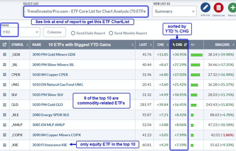
The following images come from the summary view of the TrendInvestorPro core ETF ChartList, which has 72 ETFs covering equities, commodities, bonds and crypto. The period setting is year-to-date (YTD) with the first example sorted by the year-to-date percentage change (% CHG) to see the leaders at the top. I added the SMA(200) column to see how far above/below each ETF is from its 200-day SMA. There are three performance takeaways.
First takeaway: commodity ETFs are leading. The image below shows the 10 ETFs with the highest year-to-date gains. Nine of the top ten are commodity-related ETFs. We are seeing strength in precious metals (gold, silver), industrial metals (copper, copper miners) and integrated energy (XLE). Broady speaking, this tells us that commodities are preferred over stocks.
TrendInvestorPro covered the leading equity and commodity ETFs in our reports/videos this week. We saw breakouts in Aerospace-Defense and continued leadership in Insurance. Gold has blue skies as it trades near all-time highs, while Copper is looking dicey as it goes parabolic. Click here to take a trial and get immediate access.
Second takeaway: Equity ETFs from non-cyclical groups show relative strength. These include Aerospace-Defense (ITA), Insurance (KIE), Healthcare (XLV), Telecom (IYZ) and MLPs (AMLP). Non-cyclical groups are more insulated from economic fluctuations and often hold up better during periods of economic uncertainty.
Third takeaway: Equity ETFs from cyclical groups show the most pronounced downtrends. The example below is sorted by percent above 200-day SMA. The furthest below their 200-day SMAs are at the top and showing the most pronounced downtrends. Here we see ETFs related to Housing (ITB, XHB), Retail (XRT) and Semiconductors (SMH, SOXX). This is not the performance profile of a bull market.
Need an organized and focused ETF ChartList that covers all bases? Our Core ETF ChartList has 72 names organized in a logical top-down manner. It includes 59 equity ETFs, 4 Treasury bond ETFs, 7 commodity ETFs and 2 crypto ETFs. Sign up for a trial at TrendInvestorPro and I will share this ChartList.
/////////////////////////////////////////////